Wednesday, October 26, 2011

1.) [No Image]
Joseph Muller-Brockmann 1914-1996

2.)
Joseph Muller-Brockmann was a Swiss illustrator and designer in the mid 20th Century. His name would become nearly synonymous with Swiss Design, part of the International Typographic Style. His concepts, derived from Modernism, set the rules for the Swiss style of design. Living and working in a cosmopolitan Switzerland gave him the opportunities and influence from a multinational base. He was well-traveled, spent time in the United States and was well-acquainted with many top world designers including Paul Rand.


3.) [No Image]
He was very accomplished and well recognized. In Switzerland he became a member of an underground alliance of modern artists and designers in 1937. In 1951 he became a member of the International Graphic Alliance. He taught at the Zurich School of Art from ‘57-’60, worked as a design consultant for IBM from ‘67-’88, founded and operated an advertising agency, and published books on the history of design, as well as, on his own design concepts. He won the Brunel Award for design excellence three times, in ‘85, ‘87, and ‘94. He won the Gold Medal of the Canton of Zurich in ‘87, was nominated by the Royal Academy of London as an Honorable Royal Designer, and won the Middleton Award for art and design in 1990 in Chicago.

4.) [No Image]
Muller-Brockmann was born in 1914 in Rapperswil, Switzerland near Zurich. In his early career, he began studying graphic design in his late teens as an apprentice and later at the Zurich School of Art. His immediate inspiration came from his teachers, designers Ernest Keller and Alfred Willimann, and photographer Hans Finsler, as well as, other emerging modernist Swiss designers. Muller-Brockmann built a large variety of skills from a lot of influence and had many directions to choose from. He worked as a free-lance designer and illustrator in the mid-‘30s.

5.) [No Image]
This was during World War II and Muller-Brockmann served some time as a lieutenant in the Swiss Army from the late ‘30s to early ‘40s. Switzerland remained politically neutral during the conflict but remained ideally traditional and followed neo-classical style, much like the Nazi regime in Germany. Nazi standards for art were classical with motifs of victory and prestige. Expressive and modern art was frowned upon and prosecuted. Small groups of graphic designers exiled from Germany moved to Switzerland and began a small modernist movement.

6.) [No Image]
Photography was a swiftly advancing technology and was advancing in the design field. Its precision influenced younger designers to explore the artistic value of such precision and constructive form.

7.)
After the war, Swiss style began to move away from the neo-classical style to a modern geometric style. It was an attempt to move away from traditional styles that now became associated with fascism. One of the biggest style changes in design was typeface. The Typographic Style rejected fonts associated with neo-classicism, such as Times Roman and opted for a font separate from any negative political prejudices. This font was called Akzidenz-Grotesk, a sans-serif font, similar to Arial and Helvetica, created in 1896. Akzidenz-Grotesk was simple, geometric, and void of any bias.


8.)

In the late ‘40s, Muller-Brockmann resumed illustrating and advertisement design. His drawing style was expressive, surreal, and even cartoonish. Some of his advertisements were for Hermes typewriters. In 1945, an early ad shows a very detailed drawing of a scene with cartoon figures in different window settings at work with their typewriters. Again, this is much more illustrated than designed.


9.)

These ads from ‘49-’51 show more showcasing of the product with colorful drawings and designs.


10.)
This last one is characterized and evokes family or household everyday use.


11.)
His illustrative works include campaigns for the Zurich Police which depict petty crimes as wire-framed cartoons.


12.)
This one shows a cartoon pick pocket in a newspaper page.


13.)
In the 1950s, Muller-Brockmann made an abrupt shift in his designs. These examples of Zurich June Festival concert posters from 1950 show the same type of wire-frame characters in expressive fashion.


14.)
The following years in ‘51-’53, illustration was omitted and replaced with structured objective form.


15.)

In ‘52 Muller-Brockmann began to experiment with and use Akzidenz-Grotesk typeface, and it became his preferred choice for its modern appeal and unbiased form. He designed this accident barometer for the Zurich Police as a means to promote traffic safety awareness. Akzidenz-Grotesk was simple enough for stats and allowed for viewer impact by its message.


16.) [No Image]

By this time, Swiss Design included and Muller-Brockmann used precision layouts and neutral objectivity, leaving out subjective individual expression. The structure used geometric grid systems to simplify and align elements of typeface and graphics. Illustrated representations of renditions were substituted with photographed images for their precision. Many designs were asymmetrical. This became the preferred format for its clarity over elaborate designs and ornamentation.


17.)

This 1953 poster by Muller-Brockmann for traffic safety called “Watch That Child” shows two photos, asymmetrical in size and range, composed to make a dramatic, angled view. The simple yellow band at the bottom grounds the figures, and the white font stands out on top the dark photo.


18.)

“The Friendly Handsignal” of ‘55 has an outstretched, gesturing hand presiding over the bustling traffic underneath. The font stands alone and travels in the direction of the hand to emphasize it.


19.)


This poster of ‘57 questions risky overtaking by wedging the small motorcycle between to cropped cars. This emphasizes the tight squeeze and again the yellow bottom grounds them.


20.)
This concert poster from ‘59 uses a cropped transparent photo over a solid color background. The photo slices the page in half and the large text balances the composition. There is some minor grid alignment with the text.


21.)
These product ads incorporate the item in with the composition to make the product a piece of art. The use of grids is very evident here and the black silhouette shapes evoke a modern feel.


22.)

This ad for phone service includes graphic elements that are better incorporated to animate the scene but still relies on simple modern ideals.


23.)
This ad for moving walkways from 1962 incorporates photos, manipulated to emphasize motion, with simple graphic elements and colors to depict the walkway.


24.)

This is packaging for a 1954 sleeping pill and uses transparent telescope photos of space as the backdrop, a solid color background, and overlaid graphic elements.


25.)

This ad for medication is unaligned with the picture plane but the text and photo are aligned in their own plane. The right side of the wall creates the margin for the text below.


26.)

Finally, this poster of 1960 reads “Less Noise” as a campaign against traffic congestion. Again, the text is vertically aligned with the photo of the woman.


27.)

Some of those later photo works employed the use of grids to structure and align the layout which allowed sharper, dramatic, angular organization. Much like these two examples, the grid is a simple makeup of horizontal and vertical lines that Muller-Brockmann then used as a framework for either adding more sophisticated graphical elements or designs, or for tilting the composition within the plane as a whole.


28.)

This 1953 Zurich concert poster uses a grid that bisects the page and uses two angled lines to find a center for a circle from which the rectangles encompass. The text box starts at the base of the circle.


29.)

The ‘55 Zurich Beethoven concert poster uses a grid that radiates from the center of a cropped circle. The gird is separated by equal angles, making a guide for measuring out the circular elements that double in width the further from the center they get.

30.)
This ‘55 Zurich concert poster is based off of experimental photography using transparent line samples arranged in a variety of text compositions.


31.)

A ‘59 concert poster uses only a grid in one area and much of the grid designates negative space.


32.)

A ‘68 concert poster uses this grid to align text boxes.


33.)


34.)


35.)


36.)

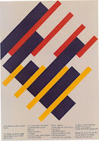
Some of Muller-Brockmann’s posters utilize simple but vibrant color schemes.


37.)

This one uses overlapping colors.


38.)

This one uses different shades of color with varying graphical elements.


39.)


40.)


41.)


42.)

This poster creates graphics that appear on a separate area, detached from the text.


43.)

This one has overlapping fonts of different shades.


44.)

This one has block text using color to highlight information.


45.)

This is an asymmetrical version.


46.)

Here is an array of Zurich concert posters from ‘64-’69 using a variety of colors and font sizes.


47.)

Color ads from ‘63-’65


48.)

Transparent photo ad


49.)

‘68 Zurich poster with a simple color scheme and varying text size